Turning a major operational change, a new booking system, and a state-by-state rollout into one clear buying experience for The Good Guys
MY ROLE
I owned the UX across the product page, cart, and checkout, and contributed to the post-purchase booking experience. The core of my role was acting as the connective tissue between teams, translating complex requirements from product, engineering, merchandise, and Home Services into a flow that actually works for customers. A lot of the work was designing around real system limitations rather than an ideal world, and keeping the experience consistent even when the back end behaved differently by region.
PROBLEM
This wasn't a simple interface project. Installations were moving to a separate team, delivery and install became two visits instead of one, and the whole thing had to plug into a brand new Salesforce booking integration. On top of that, the rollout was phased state by state, meaning some regions would go live before others, and some areas wouldn't have coverage at all. The design had to absorb all of this complexity, availability by location, date buffers, optional add-ons, system response times, regional differences, and still feel simple to a customer just trying to buy a TV.
PROBLEM STATEMENT
How do we design one clear, reliable buying experience on top of a new operating model, a new booking system, and a region-by-region rollout, without exposing any of that complexity to the customer?
COMPLEXITY
A two-step delivery and install model
A new Salesforce booking system
Several delivery types in one order
Add-ons, pricing tiers, and a phased rollout
Buffer time between delivery and install
CONSTRAINTS
API couldn't check eligibility by postcode
Some regions will be live before others
Consistent UX despite varying back ends
Shopify's checkout is hard to customise
Some regions have no install coverage
One experience, different back ends

Mapping the full journey
Before designing screens, we mapped the entire flow end to end, across:
- Installation modal;
- Mini cart;
- Shopify checkout.
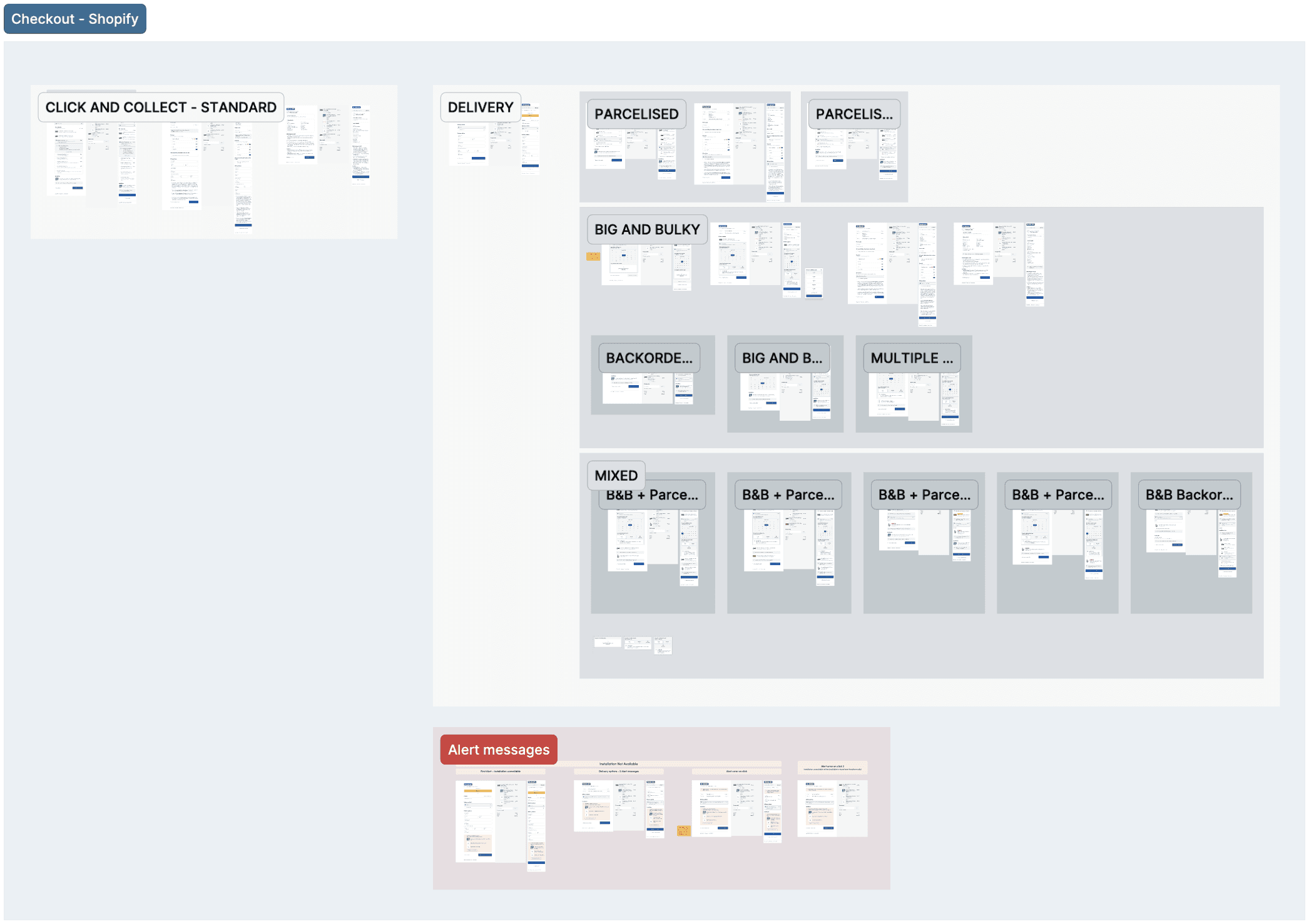
Including every decision point, error state, and edge case, this was part of the work that made the complexity manageable. By laying out every path in one place, from changing your location to unsupported areas to the different delivery types, I could see where things broke down and design each state with intent.
The customer journey
Behind the scenes the flow spans four systems and several teams, but to the customer it needed to read as one simple path: choose installation on the product page, confirm it in the cart, pick a date at checkout, then track the booking afterwards. Hiding the complexity was the whole point.
01
Product page
Choose install and add-ons
02
Add to mini-cart
Confirm services and price
03
Checkout
Pick delivery and install dates
04
Post-purchase
Track and manage the booking
Solving location upfront
A pain point we wanted to solve right at the start of the flow was location. Customers needed to know upfront whether installation was available where they lived, before getting deep into their purchase.
Location can be changed in three different places across the site, so I worked closely with the developers to keep the experience the same across all pages. On a first visit, the site either auto-locates the customer, if they allow it, and sets a store automatically, or lets them set their location for the first time.
When installation is available, the service options unlock and the customer can book with confidence. When it's unavailable, they get a clear message explaining why, with the option to call or visit a store, since some locations can still arrange installation offline even when it isn't offered online. To set the right expectation without overpromising, I added "availability may vary by location" beneath the field.
Because this lived inside a space-constrained side modal, I made the components collapsible, so the experience stays compact and scannable, especially on mobile, instead of forcing a long scroll.
Installation services in the mini-cart
Customers can add an installation service and related add-ons to their TV straight from the cart, with detail revealing progressively so the mobile view stays compact.
Key decisions:
The old design used radio buttons, which can't be deselected, forcing a permanent "No thank you" option at all times. I suggested Checkboxes to remove that clutter, customers just untick to undo a mis-selection.
Only one installation can be selected at a time, picking one swaps the other. Add-ons like cable hiding and old-TV removal sit on top and combine freely.
Installation details (what's included, excluded, and its add-ons) appear only once selected. This progressive disclosure protects limited mobile space in the mini-cart.
The CTA adapts to intent: "Checkout Now" when nothing's selected, shifting to "Add Installation to Cart" once a service is chosen. Adding the product and add-ons in one step was a requirement from the start.
Next iteration:Richer, product-specific add-ons. TVs support a lot of extras, so we explored deeper configuration (a bracket-size slider and other inputs) that development constraints kept out of this release. It's planned for a future update, where the add-on set scales by product type as the pattern rolls out beyond TVs.
Built to scale. Revealing add-ons only after selection is intentionally future-proof: it absorbs four or more add-ons cleanly without bloating the initial view.
cross-teams and limitations
Much of this happened alongside other teams. I worked with engineering to shape the booking experience around what the Salesforce system could actually do, like how quickly install dates load and the fact that availability couldn't be checked by postcode alone. I worked with merchandise to cut the install pricing from five size tiers to three, matching the in-store price. And because the rollout was phased and some regions needed manual handling at first, I designed one front-end experience that stayed the same no matter which path an order took behind the scenes. Shopify's limits shaped a lot of the decisions, so the work had to be practical.
CHECKOUT (shopify)
LIMITATIONS
Shopify's checkout gives you very little room to change its UI, themes are so limited that changing a single border colour cascades across every element in every step. Working inside those constraints, I built new variants from Shopify's own components that actually fit the TV installation flow, like a calendar adapted into an installation date selector, keeping a complex purchase feeling linear and contained.
RE-Confirming location
Adding your personal details and address is the first step once you click into checkout, and because installation availability and pricing depend on location, the address entered here becomes the source of truth rather than what was set while in mini-cart. If it can't be serviced, an installation-removal alert appears and they can proceed without installation in cart.
The checkout steps
The flow opens with personal details and payment, capturing contact info and how they'll pay, card, PayPal, Apple Pay, Google Pay, or a buy-now-pay-later option like Afterpay or Zip. From there it moves to delivery method, then fulfilment and installation where the product path and add-ons are confirmed, and finally a post-purchase screen after the order is placed.
after purchase
Because one order could include several parcels, a big-and-bulky delivery, back-orders, and an installation, customers needed to know what happens next. Some customers assumed delivery and installation could happen on the same day, so I added an alert message clarifying they're scheduled separately, which cut down on the last-minute cancellations this was causing. A "What happens next" section then walks customers through the next few days, payment, prep, tracking, and how their installation booking is managed.
DELIVERY + INSTALLATION CALENDAR
When a delivery date can be chosen via calendar, we suggest an installation date right after it, the next available slot once delivery is done. If the customer prefers a different day, they can pick their own. Because the installation date depends on the next available delivery date, and the API can sometimes take a little longer to return it, we added a short message letting customers know dates may take a moment to load, so they're aware and don't leave the page.
For some products, a delivery date can't be shown at checkout. In those cases, the customer gets a text letting them know when their product will arrive, then a second SMS so they can book their installation once it's been delivered.
Measuring and learning
The experience is built and rolling out mid 2026. We use Google Analytics and Microsoft Clarity to track how customers move through the new journey and verify the numbers as it goes live. Because installation communication was missing before, this rollout gives us a clear baseline to measure against, watching for steadier checkout conversion through the change and a lift in TV sales from clearer information up front.
What's next
The plan is to launch with TVs first, then use that release to A/B test and learn what works. From there, the same model rolls out to other products that come with add-ons and installation, like kitchen appliances and AV gear. This project helped me to improve on solving complex technical problems while keeping things clear and reassuring for the user.