INTRODUCTION
OnePass is a membership program that brings you more value from some of the biggest Australian brands including Kmart, Target, Bunnings Warehouse, Officeworks and more. For $4 a month, OnePass members get:
OnePass is a membership program that brings you more value from some of the biggest Australian brands including Kmart, Target, Bunnings Warehouse, Officeworks and more. For $4 a month, OnePass members get:
• Free delivery no minimum spend, on eligible items or orders.
• 365 day returns for change of mind at Kmart, Target, Catch and Officeworks.
• Express Click & Collect at Kmart and Bunnings Warehouse.
• 5x Flybuys points in-store and with Click & Collect orders at Kmart, Target, Bunnings Warehouse and Officeworks.
• ...and more!
MY ROLE
As the sole UI/UX Designer on this project I led a design sprint, develop a new user flow as well as executing and delivering a new product feature and design initiatives. Stakeholder management was key on this project due to how complex and challenging the scope was. Additionally, I worked on digital design assets for eDMs and paid social media.
As the sole UI/UX Designer on this project I led a design sprint, develop a new user flow as well as executing and delivering a new product feature and design initiatives. Stakeholder management was key on this project due to how complex and challenging the scope was. Additionally, I worked on digital design assets for eDMs and paid social media.
PROBLEM
With the Black Friday period approaching, OnePass faces several UX challenges to develop a compelling offer to attract and retain subscribers.
Many potential subscribers are unaware of OnePass and its benefits. Without effective communication, the Black Friday promotion may miss its target audience, resulting in missed acquisition opportunities. While Black Friday offers a great promotional window, potential subscribers may question OnePass' overall value. Therefore, clearly articulating benefits beyond Black Friday deals is crucial to encourage sign-ups.
PROBLEM STATEMENT
How can OnePass optimise its Black Friday offer increasing sign-ups and long-term membership retention?
How can OnePass optimise its Black Friday offer increasing sign-ups and long-term membership retention?
GOALS
USER GOALS
• Exclusive deals and promotions for Black Friday period
• Exclusive deals and promotions for Black Friday period
• Sign-up incentive
• Personalised recommendations
• Long-term value and satisfaction
BUSINESS GOALS
• Increase subscriber acquisition
• Enhance brand awareness
• Differentiate from competitors
• Maximise revenue generation
• Foster long-term customer loyalty
DESIGN SPRINT
During 5 days we conducted design sprints to foster collaboration across departments, where Designers, Product Managers, Business Analysts and other stakeholders came together to generate ideas quickly. These sprints were essential for us to iterate on solutions and prototyping.
We were divided into five distinct groups, each dedicated to a specific OnePass CVP (customer value proposition), such as 5x Flybuys or 365-day returns. I took on the role of the sole designer responsible for the Early Access benefit.
FLOWS
The user journey presents a complexity, with three primary focus areas:
•Awareness channels [Website, Social media, eDMs, etc]
•Sign Up journey [50% discount offer incentive to signup]
•Checkout journey [All participating brands checkout journeys with OnePass]
•Sign Up journey [50% discount offer incentive to signup]
•Checkout journey [All participating brands checkout journeys with OnePass]
USER RESEARCH
The most critical part of the Early Access journey is the signup where we need to make the offer as clear as possible, reduce friction and the risk of user abandonment.
Utilising our prototypes, usability testings and user questionnaires were conducted through Askable with 12 people. The main objective was to gather quantitative insights into user preferences and behaviours when presented with two different sign-up options during a Black Friday promotion. Additionally, we tested the impact of a modal in the experience.
SIGNUP JOURNEY
As research showed, Scenario 1 with the modal was the preferred choice by users. Our design team (Myself, Fiona, Sophie, Franz, and Aidan) collaborated to shape all touch points for the entire Black Friday experience journey flows, including how current users should go about changing their current subscriptions to the 50% off annual offer.
As research showed, Scenario 1 with the modal was the preferred choice by users. Our design team (Myself, Fiona, Sophie, Franz, and Aidan) collaborated to shape all touch points for the entire Black Friday experience journey flows, including how current users should go about changing their current subscriptions to the 50% off annual offer.
REBRAND
While we were designing the new CVP experiences, OnePass' Marketing team, in partnership with CHEP Network, worked a new go-to-market rebrand. Onesie, our mascot, was the perfect solution to communicate value to Australian families.
CHECKOUT JOURNEY
I utilised our design system to compile a file containing recommendations for all design teams across OnePass brands (Target, Kmart, Catch, Bunnings, and Officeworks) on how the shopping experience during the Early Access/Black Friday period should look like.
OnePass' app and website were not promoting any products therefore the checkout journey would be done by their own Design team, our job was to create a simple system suggestion that would cater to all different brands, giving them a few options for the checkout solution.
We utilised the SupaBrand logo to represent all Wesfarmers brands, in order to reduce unnecessary document reworking.
AWARENESS CHANNELS
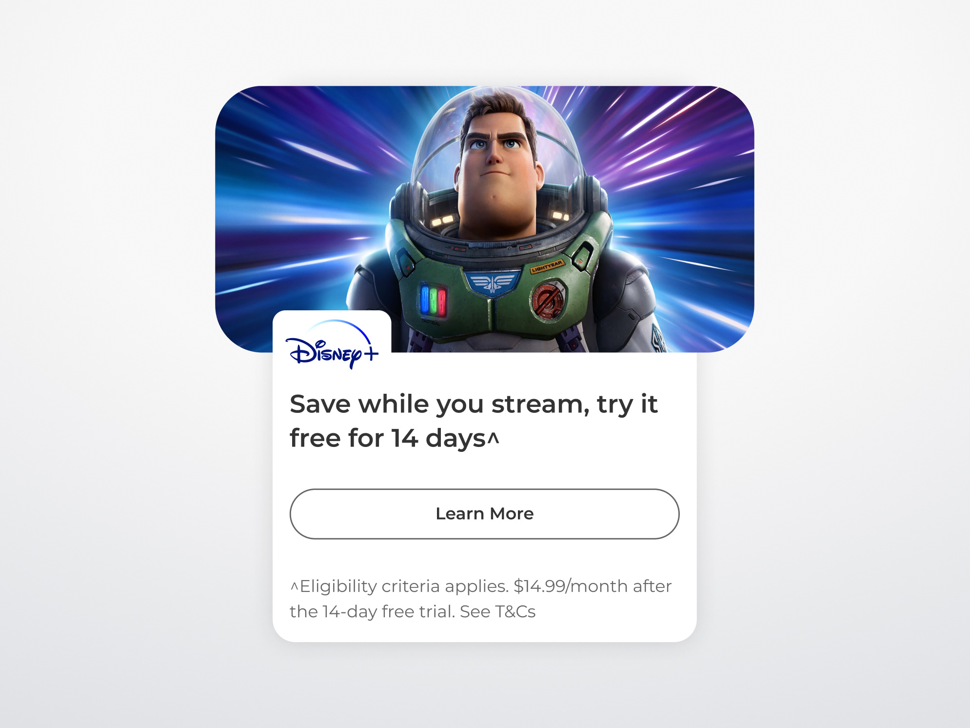
We designed assets to cover every step of the Early Access experience. Electronic direct messages, social media ads, website, and mobile app were the main channels. Below, you can see some key interfaces.
THE IMPACT
+137.000 new subscribers
1.5% churn reduction
9% spend uplift from loyal customers
The campaign provided exclusive value to OnePass subscribers, gave customers better availability to high-demand products, and made them feel like they were part of an exclusive community.
KEY LEARNINGS
Leading the design sprint and managing diverse stakeholder expectations improved my ability to integrate user-centered design needs with business objectives effectively.
On a technical note, we built all features thinking ahead in case we would need the same resources for either a similar experience or a completely new initiative. With data from this campaign period we could improve or enhance our product accordingly.
The project's results, such as the increase in subscribers and lower churn rates, showed how aligning design solutions with strategic marketing efforts can lead to great benefits.


